Hygiene & care / Case study
Sun Group
Two countries. One connected brand story.
Explore the live website(opens in a new tab)- Sector
- Hygiene & care
- Audience
- Business customers across Dubai & Mumbai
- Project focus
- Cross-market identity · Brand storytelling · Contact visibility
01 / The context
The brand behind the website.
Sun Group's digital presence brings its Dubai and Mumbai roots together, introducing a business built around hygiene and care since 1998. The wider website connects the group story with its Naturoll, SunClean and The Soap Lab brands, manufacturing divisions and contact routes.
02 / The objective
What the experience needs to do.
Bring two locations together without splitting the brand.
Sun Group’s homepage needs to introduce both its geographic footprint and its hygiene-and-care proposition. The design balances these messages in one immediate visual story, while keeping a simple route into the company and its contact options.
03 / The approach
The thinking behind the design.
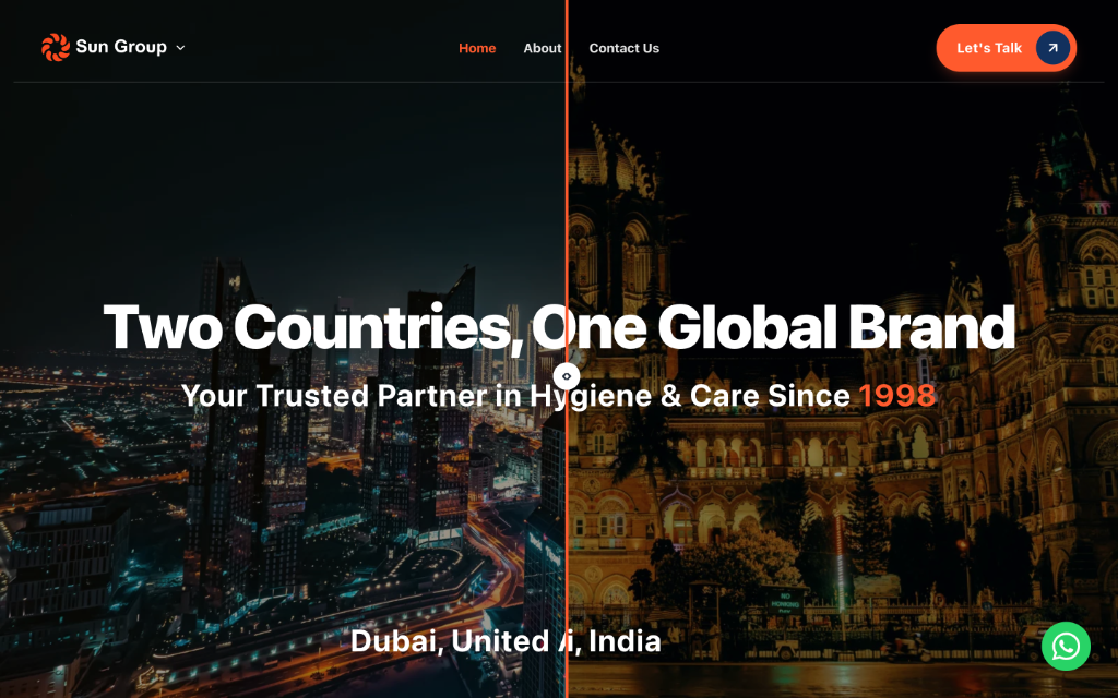
A split cityscape places both locations at the heart of the homepage. Bold type, dark tones and the brand's orange accent create a confident introduction, with a prominent route to start a conversation.
Make geography part of the story
The Dubai and Mumbai cityscapes are presented together in a split-screen hero. This makes the relationship between the two locations visible before a visitor reads further. The composition gives a concrete setting to the idea of one brand operating across two countries.
Give the core message a clear hierarchy
A large white headline establishes the cross-market identity, followed by a shorter statement about hygiene, care and the business’s history. The restrained navigation leaves those messages in focus rather than surrounding them with competing choices.
Use one accent for recognition and action
The orange brand colour appears in the logo, key emphasis and the prominent contact invitation. Against the dark city imagery, it creates a recognisable visual thread and helps the primary action stand apart from the rest of the page.
04 / The visitor journey
From first impression to next step.
Understand the footprint
The paired city imagery introduces the connection between Dubai and Mumbai.
Identify the business
The supporting headline sets out the hygiene-and-care proposition and the history behind it.
Explore the company
Brand and division content introduces the wider offering, with routes into Naturoll, SunClean and The Soap Lab.
Make contact
The prominent conversation button and visible WhatsApp entry point provide a clear next step.
05 / In the website
Details that make it work.
Dual-location hero
A distinctive visual introduction to two markets under one brand.
High-contrast messaging
White display type and orange emphasis over dark city imagery.
Connected brand portfolio
Dedicated routes into Naturoll, SunClean and The Soap Lab connect the group with its individual brands.
Visible contact paths
A primary conversation action and WhatsApp access support direct enquiries.
06 / The delivered experience
One clear brand story across two locations, with contact always within reach.
The homepage turns a potentially fragmented geographic story into one recognisable identity. Its value comes from clarity: visitors can identify the business, understand its two-country presence and find a contact route within the same introductory experience.
Next case study / Skincare
SOHL SKIN
Putting a modern skincare product in the spotlight.
Explore the project