Skincare / Case study
SOHL SKIN
Putting a modern skincare product in the spotlight.
Explore the live website(opens in a new tab)- Sector
- Skincare
- Audience
- Skincare shoppers exploring a twist-stick format
- Project focus
- Product storytelling · Format education · Shopping journeys
01 / The context
The brand behind the website.
SOHL SKIN introduces twist-stick facial masks designed for modern life. The website gives the product range a clear, visual introduction.
02 / The objective
What the experience needs to do.
Make an unfamiliar product format feel immediately understandable.
A twist-stick facial mask needs both an appealing introduction and a practical explanation. The design has to show the product clearly, explain how it fits into a routine and provide an obvious route into the range. Product education and visual appeal need to work together.
03 / The approach
The thinking behind the design.
Warm light, natural textures and a product-led hero let the range speak for itself. Concise messaging explains the format, while a direct invitation to explore products keeps the journey focused.
Make the product the main event
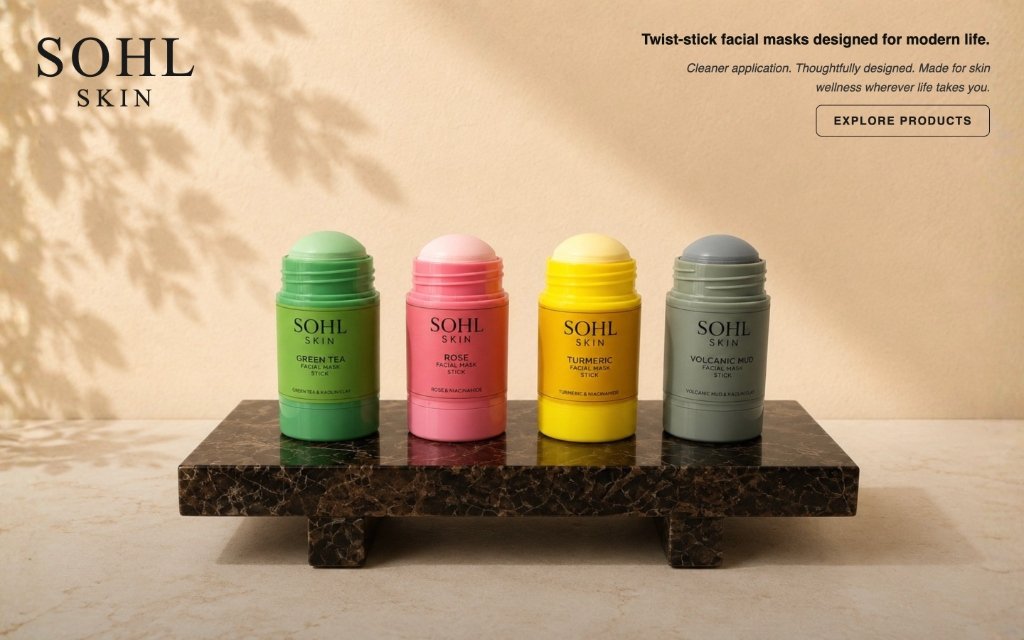
The featured homepage composition uses warm light, tactile surfaces and a group of coloured mask sticks. The product shape is visible at a glance, while the restrained surrounding copy gives the range space to stand out. The presentation connects the brand’s premium visual language with a practical everyday object.
Explain the format in manageable steps
The website breaks the facial-mask ritual into a sequence of short actions. This makes the format easier to understand than a long block of instructions. Product-use information sits alongside lifestyle context, giving visitors both a practical and an everyday reason to explore.
Keep exploration close to the product
Product calls to action, collection browsing and dedicated product navigation let shoppers move from learning to exploring the range. Supporting discovery, brand and FAQ content offer additional context without making the hero carry every detail.
04 / The visitor journey
From first impression to next step.
See the format
Product imagery and the opening message introduce the twist-stick approach.
Learn the ritual
Short instructions explain how the facial-mask sticks fit into a skincare routine.
Explore the range
Collection content and product navigation provide a route into individual options.
Continue with confidence
Product pages, FAQs and contact routes support the next stage of the shopping journey.
05 / In the website
Details that make it work.
Product-led visual direction
A distinctive presentation centred on the physical design of the range.
Step-by-step education
A short product-use sequence reduces the effort of understanding the format.
Collection discovery
An introduction to the facial-mask range with direct product exploration.
Shopping and support routes
Clear access to products, account, cart, FAQs and contact information.
06 / The delivered experience
A distinctive product showcase that connects the brand's visual identity with an easy route into the range.
This experience pairs an expressive first impression with practical product education. Visitors can see what makes the format distinctive, learn how it works and continue into the collection. The design keeps the product at the centre of both the brand story and the shopping journey.
Next case study / Events & consulting
Consumer Healthcare Summit
A clear platform for an industry conversation.
Explore the project